
As Creative Director and designer of a monthly golf newspaper, Tee to Green, I was given the green light to redesign the publication. The newspaper is freely distributed at golf clubs across Southern Africa so my mission was to make it visually appealing enought so as to be 'taken' seriously by it's readership.
COVER
I wanted the masthead to stand out and be as big as possible thereby strengthening it's identity. In my view, it worked to align the name with the new URL address (www.tee2green.co.za) and abbreviate the rather long title. Since it was a high volume newspaper without a contents page, I changed the coverline structure to work within these constraints. The main image area was made more prominent, with only it's coverline placed thereon. My aim is to use more graphic, conceptual cover images.
INSIDE EDITORIAL
A bold serif was introduced to give the publication a serious, newsworthy feel. A contemporary, sporty sans serif was chosen to accompany it. The use of different font weightings and stroke weights added texture to the written content. The colour pallette is restricted 1 or 2 colour swatches where possible to reduce mis-registration on the coldset press.

The old Masthead on the left and the redesigned, abbreviated version on the right.

The abbreviated brand aligned itself with the website URL.
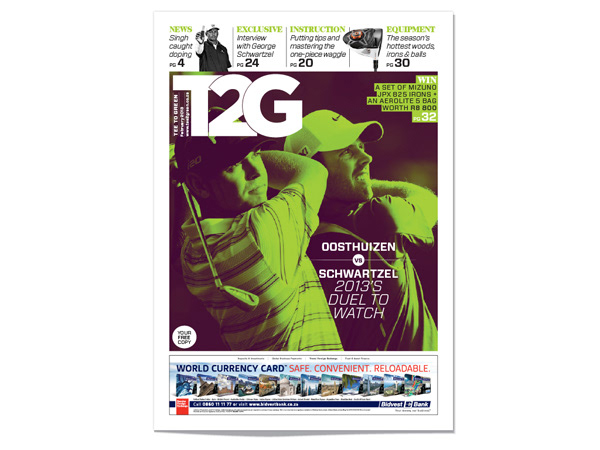
Redesigned February 2013 issue cover.
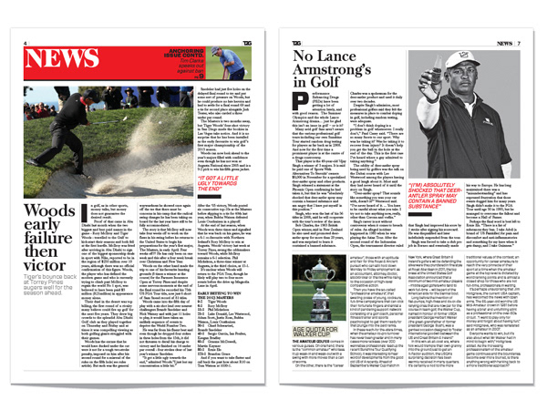
Upfront News section opener and following page.
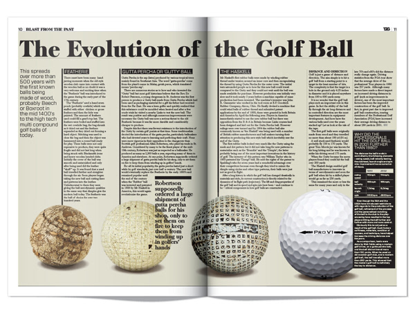
Regular 'Blast from the past' feature.
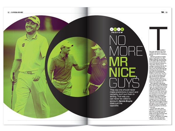
Cover feature opening spread.
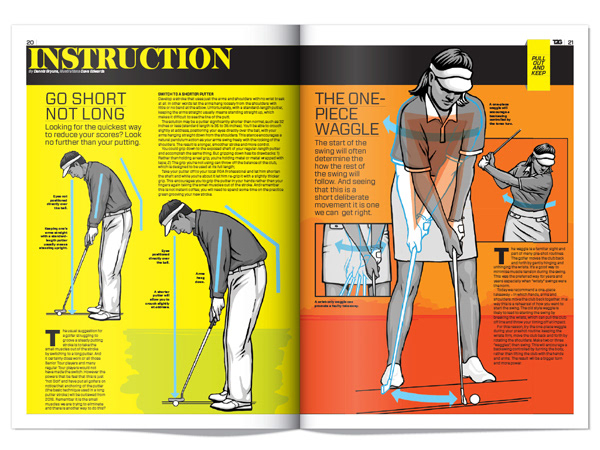
New illustrated Instruction feature.
Interview feature.

Equipment section opener and following page.
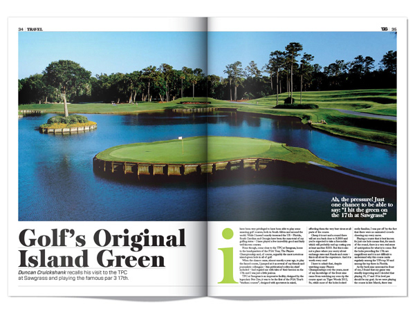
Golf travel feature opener.

Regular humour column.
